
HI.DOZO CASE STUDY
Website Redesign Improving the Ordering Experience for a Delivery-First, Michelin-Level Sushi Concept
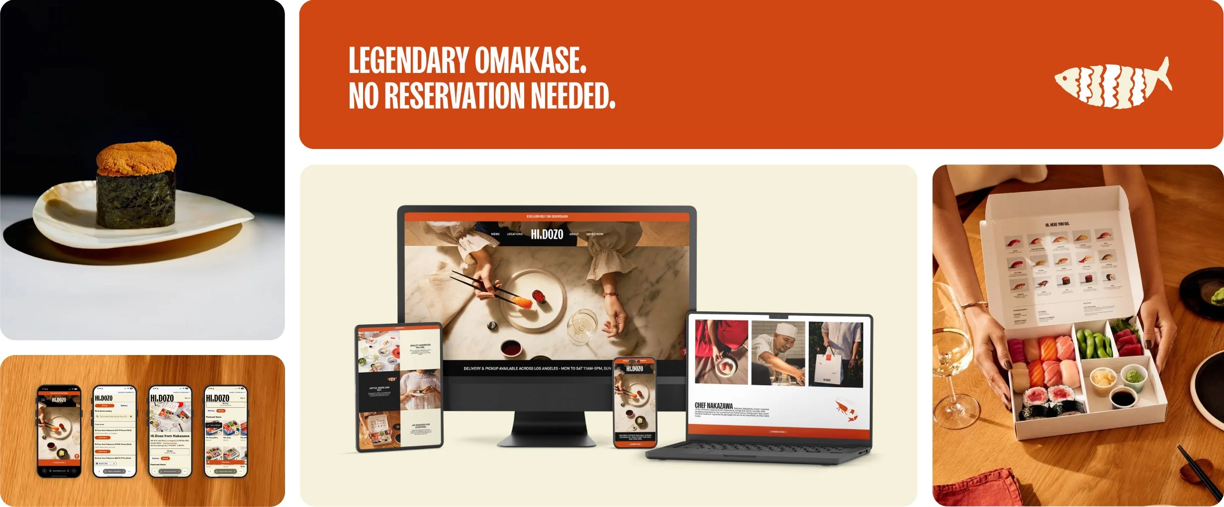

Hi.Dozo
Hi.Dozo is a delivery-only omakase concept from Chef Daisuke Nakazawa of the Michelin-starred Sushi Nakazawa, operating in Los Angeles through DoorDash Marketplace, with plans to expand into a physical location later this year. The business generates revenue exclusively through delivery and pickup orders, and at a higher price point than most delivery competitors, the website and ordering experience are the primary touchpoints between the brand and a potential sale. Following an extensive rebrand, the goal of this project was to redesign the Hi.Dozo website to support that delivery-first business model, significantly improve the path from interest to order, and elevate the digital experience to reflect the brand's premium positioning.
I led a full UX audit and Squarespace redesign paired with a direct integration partnership with DoorDash, moving Hi.Dozo onto their Commerce Platform to support a branded, low-friction ordering flow and, for the first time, give the business access to its own customer data.
SCOPE
Website redesign and DoorDash Commerce Platform integration, including UX research, heuristic evaluation, competitive analysis, information architecture, user flows, wireframing, high-fidelity Figma prototypes, Squarespace development, responsive design, image optimization, accessibility implementation, SEO, and custom code integration
DURATION
Two months, May to June 2026
TEAM
Nicole Mattson, UX/Product Designer and Web Developer
Vito Ferraro, Director of Operations (primary client stakeholder)
Claire Felske, Social Media Manager
Chloe Lloyd, Strategic Partnership Manager at DoorDash
Saman Mahini, Strategic Partnerships Commerce Platform at DoorDash
Devin Johnson, Platform Implementation Manager at DoorDash
TOOLS
Figma, Squarespace, DoorDash Commerce Platform, accessiBe, Adobe Illustrator, Adobe Photoshop, Claude (AI-assisted workflows)
THE CHALLENGE
A premium product, undermined by an unclear ordering path
As a delivery-only concept, Hi.Dozo's website has one job above all others: get customers to a confident decision to order, as quickly as possible. The existing site was not built to do this. The path to ordering was inconsistent and unclear, the delivery-only business model was never explicitly communicated, and customers had no reliable way to confirm Hi.Dozo delivered to their area before attempting to order. For a brand built on a Michelin-level reputation, the experience also fell well short of the premium standard the product itself delivers.
My objective was to redesign the site around the realities of a delivery-first business, reduce the friction between interest and order, and ensure the digital experience reflected the same level of craft and confidence as the food.
RESEARCH
Key Finding
The existing ordering flow routed customers through an unbranded, 30-second redirect link before reaching DoorDash.
Research Approach
This engagement ran on a two-month timeline without a dedicated research budget. Rather than conducting formal interviews, I built the research foundation from three sources: a complete heuristic evaluation of the existing site as a first-time user across desktop and mobile, secondary research drawn from existing customer sentiment on Yelp, Reddit, and Instagram, and a competitive audit benchmarking six relevant brands.
1) HEURISTIC EVALUATION
2) SECONDARY RESEARCH
3) COMPETITIVE AUDIT
One significant constraint shaped this phase. Hi.Dozo had no access to its own customer data at the time, since its existing DoorDash Marketplace plan kept that information restricted for privacy reasons. That meant ordering behavior and direct usability testing with existing customers weren't available to me as research inputs. Solving that gap became a strategic priority of its own, and it's ultimately what led me to recommend moving Hi.Dozo onto the DoorDash Commerce Platform, covered later in this case study.
Before
Audit Findings
Walking through the existing site as a first-time user and evaluating it against Jakob Nielsen's 10 Usability Heuristics for Interaction Design, I found four compounding issues:
Finding 1: The ordering path was unclear.
On mobile, the only path to ordering was buried in the navigation menu with no visible "Order Now" button on the page, violating Heuristic #6: Recognition Rather Than Recall. CTA copy like "Hi. Here You Go" used brand language instead of action language, breaking Heuristic #2: Match Between System and the Real World. When users did find the order link, an unbranded 30-second Bitly redirect introduced a moment of distrust at exactly the wrong moment, a violation of Heuristic #4: Consistency and Standards.
Finding 2: The business model was never explicitly stated.
Hours displayed prominently near the top of the page used the conventions of a traditional dine-in restaurant to set expectations for a delivery-only concept, a clear violation of Heuristic #2: Match Between System and the Real World. With no mention of Los Angeles or delivery radius anywhere on the homepage, out-of-range customers had no way of knowing until DoorDash declined their order.
Finding 3: The experience did not yet reflect the brand's premium positioning.
A heavy text overlay dulled the hero image and competed directly with the product photography beneath it, and long scroll sections delayed users from reaching any meaningful action. Per Heuristic #8: Aesthetic and Minimalist Design, every extra element on a page competes with the content that matters most. Here, both the visual clutter and the page length were working against Hi.Dozo's strongest assets.
Finding 4: Calls to action were infrequent and unclear.
Phrases like "From the chef's table to your kitchen table" read as brand copy rather than prompts, again violating Heuristic #2. Past the hero, there was no persistent invitation to order anywhere on the page, and no sticky CTA on mobile, violating Heuristic #6: Recognition Rather Than Recall for a brand where every visit is a potential order.
User Personas
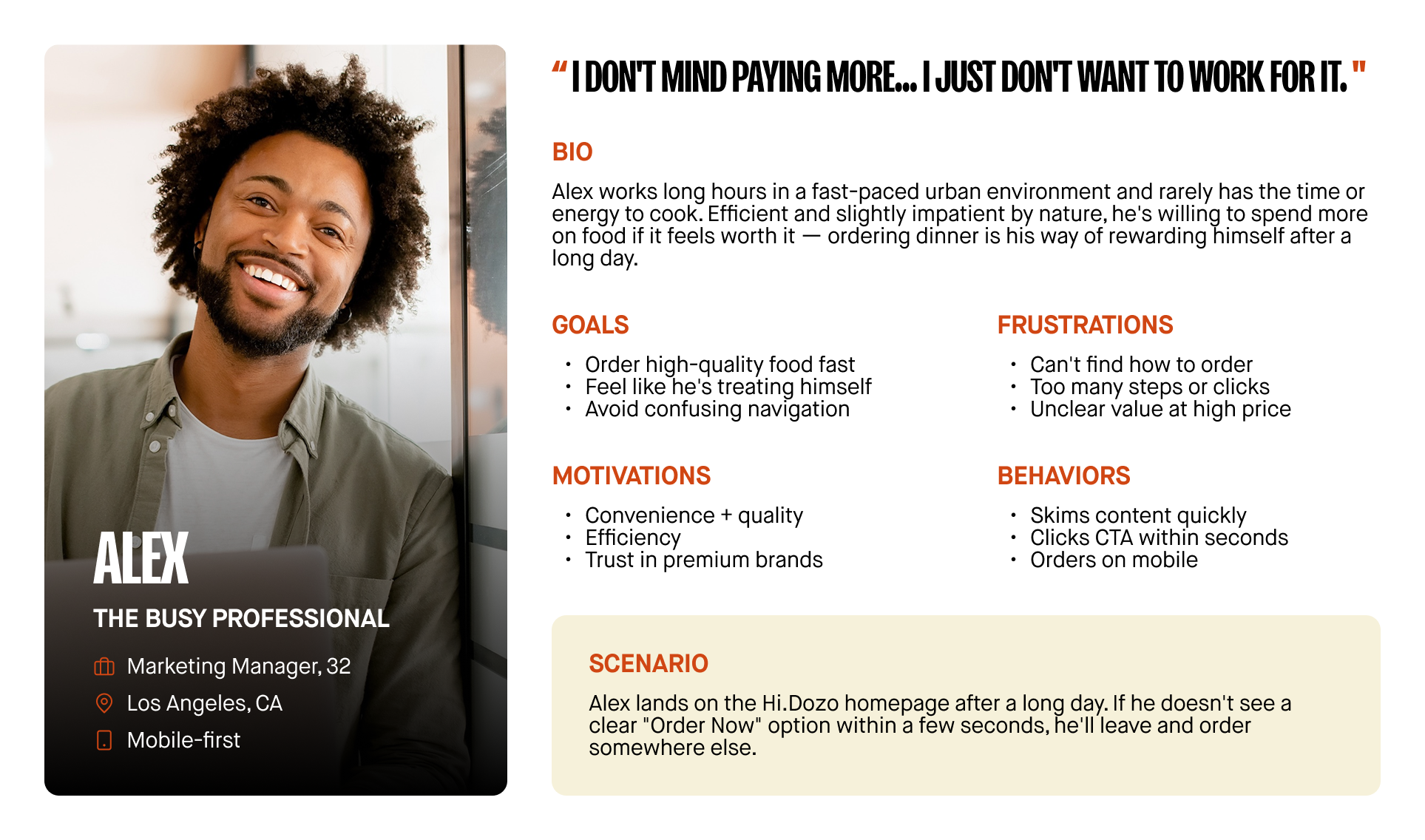
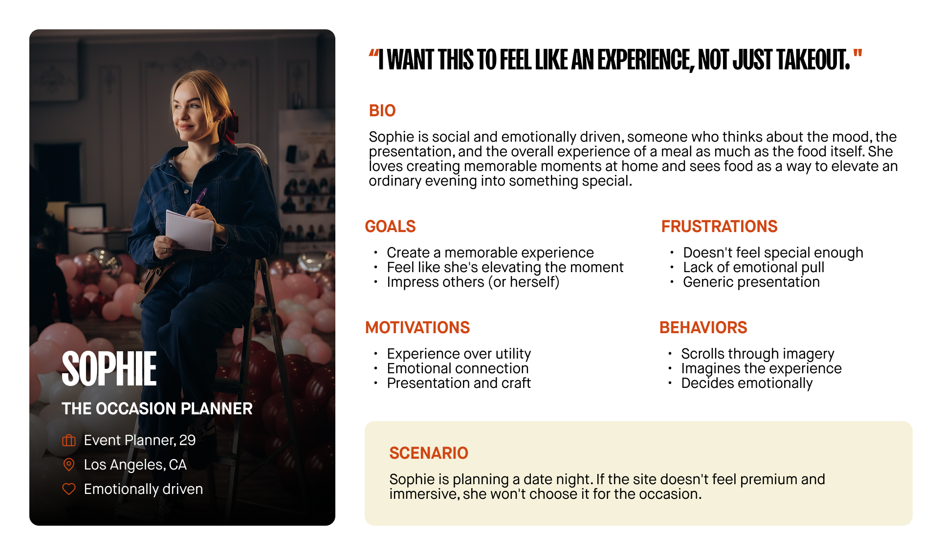
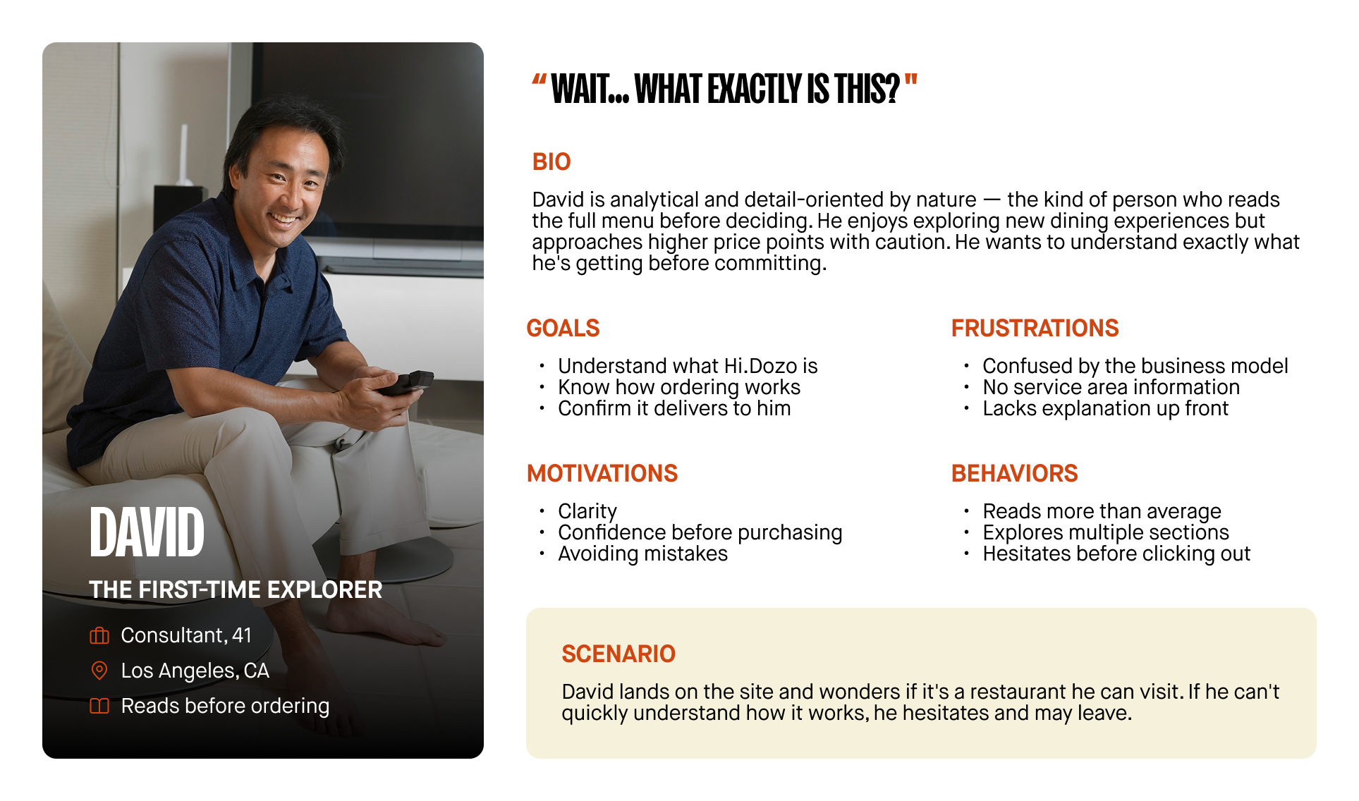
Without direct customer interviews to draw from, I developed proto-personas from client input, audit findings, and secondary research, then grouped them around three core behaviors most relevant to the project goal. Two additional personas, Maya, a Gen Z, aesthetics-driven user, and Ken, a discerning sushi enthusiast, also informed visual and credibility decisions throughout the project. However, the three personas below are featured here as the closest match to the project's primary goal statement.
Empathy and Journey Mapping
I built empathy maps and journey maps for each core behavior, including a dedicated journey map for out-of-range users: customers who engage with the site, intend to order, and are ultimately blocked once they reach DoorDash and learn Hi.Dozo doesn't deliver to their location. This edge case turned out to be one of the most consequential findings of the project and directly shaped my Locations strategy.
The Convenience-Seeking Professional
The Experience-Seeker
The First-Time Curious User
Competitive Audit
Six competitors and benchmark brands were evaluated across seven categories: first impressions, business model clarity, ordering experience, visual design, content and messaging, mobile experience, and conversion strategy. The goal was to identify what the best brands in this space do well, and where Hi.Dozo has clear opportunities to outperform them.
Two findings from the audit shaped the overall direction of the project. First, the strongest-performing sites in this category lead with food imagery rather than narrative, building desire ahead of explanation. Second, both Han Dynasty and Van Leeuwen resolve the out-of-range problem by presenting a location selector before the menu. This pattern became the foundation of the project's core recommendation.
This chart summarizes the key findings across six evaluated competitors. View the full competitive audit (including category-by-category UX ratings across all seven evaluation criteria) in the complete spreadsheet. [ Explore the Full Competitive Audit ]
DEFINE
Problem Statement
Users interested in ordering from Hi.Dozo need a clear, immediate, and trustworthy way to understand how to order and what the experience entails, because the current website does not clearly communicate the delivery-first model or provide an intuitive, low-friction path to ordering.
Four supporting problem areas mapped directly to the research findings: ordering clarity, business model confusion, a gap between the premium brand positioning and the digital experience, and a lack of service area clarity, particularly for first-time and out-of-range users.
Hypothesis Statements
With the core problem defined, I developed a set of hypothesis statements to guide design decisions and establish what a successful outcome would look like for each area of friction.
Ordering clarity.
If the website provides a clear, persistent "Order Now" CTA including a sticky mobile button and a seamless transition to DoorDash, then users will be able to quickly and confidently begin the ordering process, resulting in reduced drop-off and increased conversions.Business model clarity.
If the homepage clearly communicates that Hi.Dozo is a delivery-first omakase concept available in select Los Angeles areas, then users will understand how the service works immediately, reducing confusion and increasing trust before they attempt to order.Premium experience.
If the website prioritizes high-quality food photography, refined typography, and intentional layout aligned with the new brand system, then users will perceive Hi.Dozo as a premium, Michelin-level experience worth the price point.Service area clarity.
If the website clearly communicates delivery zones and pre-qualifies users by location before they reach the ordering flow, then out-of-range frustration and failed order attempts will decrease significantly.
Value Proposition
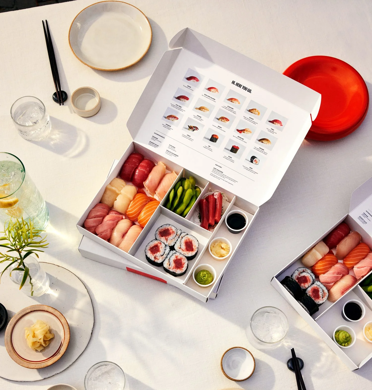
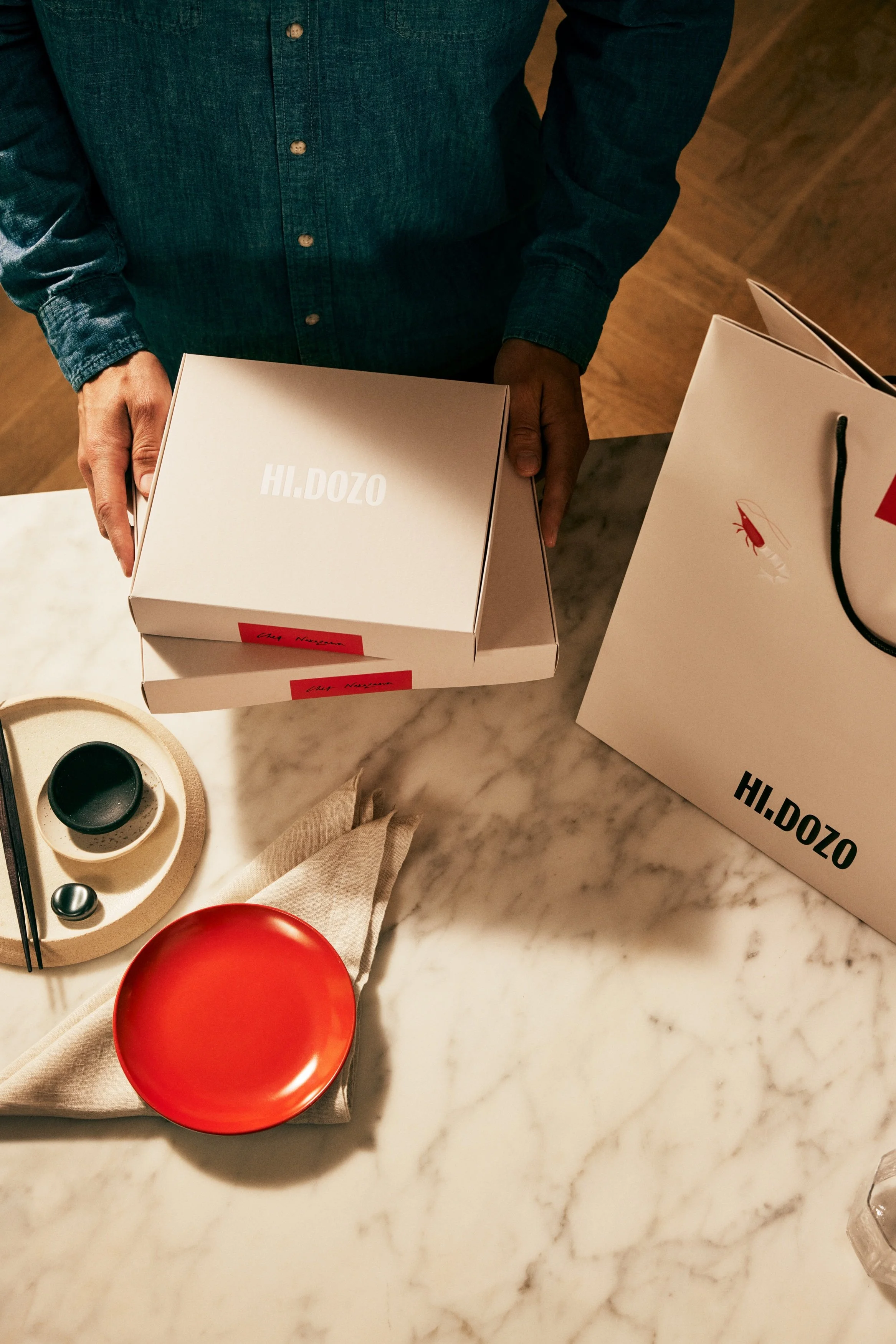
The competitive audit confirmed what the audit findings already suggested: no direct competitor was successfully combining Michelin-level culinary credibility with a seamless, delivery-first digital experience. That gap became Hi.Dozo's clearest point of differentiation.
Hi.Dozo's unique value proposition, refined through the research phase and carried through every design decision in this project:
"A Michelin-level omakase experience, delivered to your door. No reservation required."
This proposition speaks directly to each core persona. It addresses Alex's need for convenience without sacrificing quality, David's need for a clear explanation of what the service is, and Sophie and Ken's need to feel confident that the experience is worth the price before they order.

HOW MIGHT WE
The Question
How might we give customers an immediate, trustworthy path to ordering, one that confirms delivery availability up front and reflects the same premium standard as the product itself?
Directions Considered
A meaningful share of the friction in the existing experience originated on DoorDash's side of the transaction, not solely the website. I considered three directions:
Stay on DoorDash Marketplace and fix what I could within Squarespace alone.
This was the lowest level of effort, but it left the unbranded redirect, the absence of a location pre-qualifier, and Hi.Dozo's lack of access to customer data unresolved, since all three originate within DoorDash's infrastructure.Build a custom ordering flow independent of DoorDash.
This would give full control over branding and experience, but Hi.Dozo's operations are built entirely around DoorDash's delivery logistics. Rebuilding that infrastructure was outside the scope of the engagement and unnecessary given the alternative below.Move Hi.Dozo onto the DoorDash Commerce Platform.
This unlocks a fully branded storefront, a location selector page consistent with the pattern used by Han Dynasty and Van Leeuwen, a persistent mobile ordering CTA, and access to customer insights Hi.Dozo had never had. It meant closer coordination with DoorDash's partnership and implementation teams, and some reduction in control given the platform's third-party nature.
Recommendation
I recommended moving Hi.Dozo onto the DoorDash Commerce Platform. Of the three directions I considered, this was the only one that solved both the website's UX problem and Hi.Dozo's business problem simultaneously, and it was validated directly by two of the strongest competitors in the audit.
This was the pivotal call of the project. The original brief was a Squarespace redesign. What became clear through research was that the most significant friction points, the 30-second redirect, the lack of location pre-qualification, and Hi.Dozo's complete absence of customer data, all lived on DoorDash's side of the transaction, not the website. Solving for that meant stepping outside the original scope to recommend a platform migration that most web designers wouldn't have flagged as their problem to solve. Moving Hi.Dozo onto the Commerce Platform addressed all three gaps in a single decision, and it set the business up for something it had never had: a direct relationship with its own customers. That outcome was worth the added coordination complexity and the harder conversation about scope.
IDEATE & DESIGN DECISIONS
Information Architecture
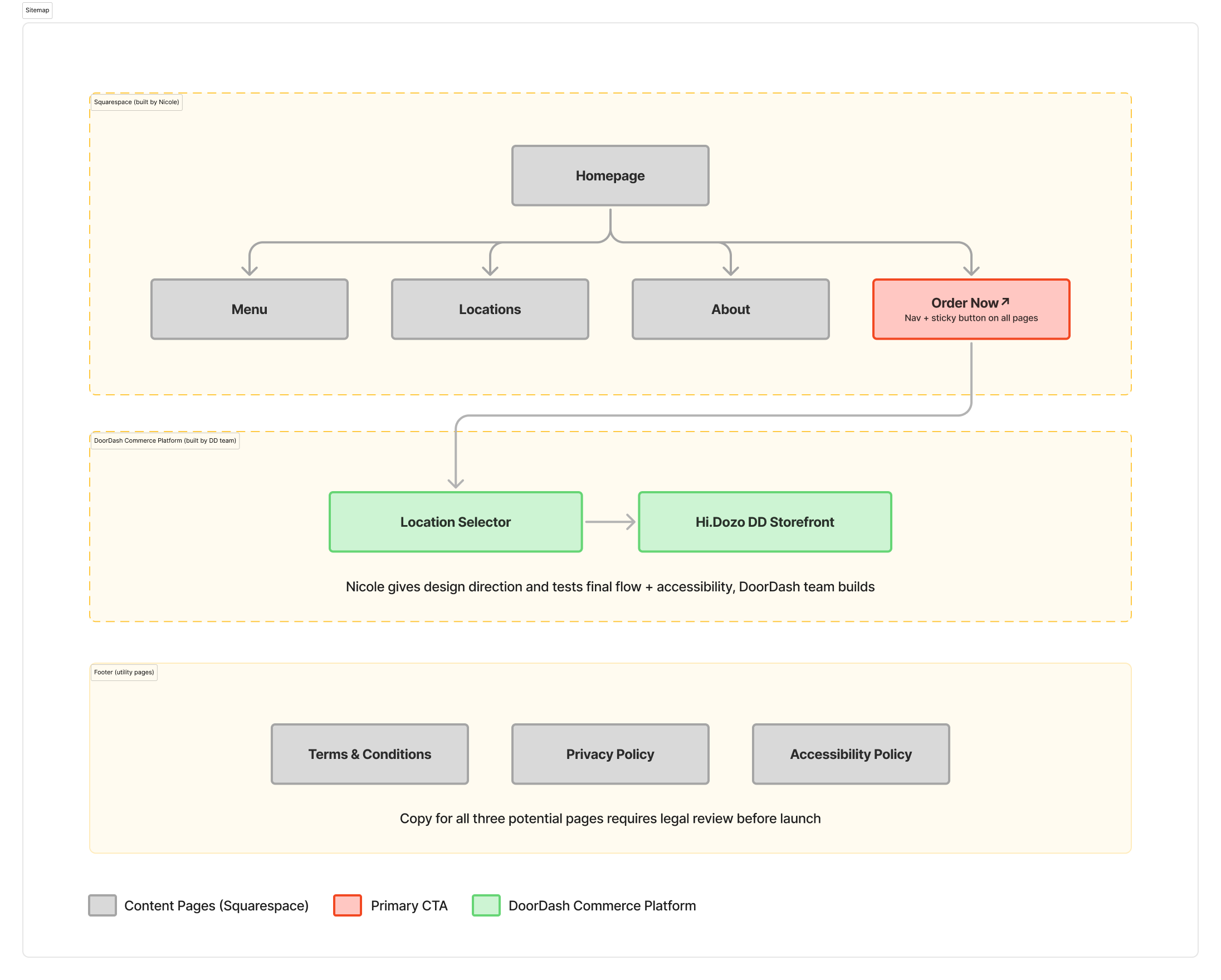
With the platform decision finalized, I mapped the full sitemap and three core user flows: new visitor, returning visitor, and the out-of-range edge case, to make sure every path led to a pre-qualified order rather than a dead end.
Key Design Decisions and Lo-Fi Wireframes
I started with low-fidelity wireframes to establish layout and hierarchy, then moved into Figma to build high-fidelity wireframes for stakeholder review.
-
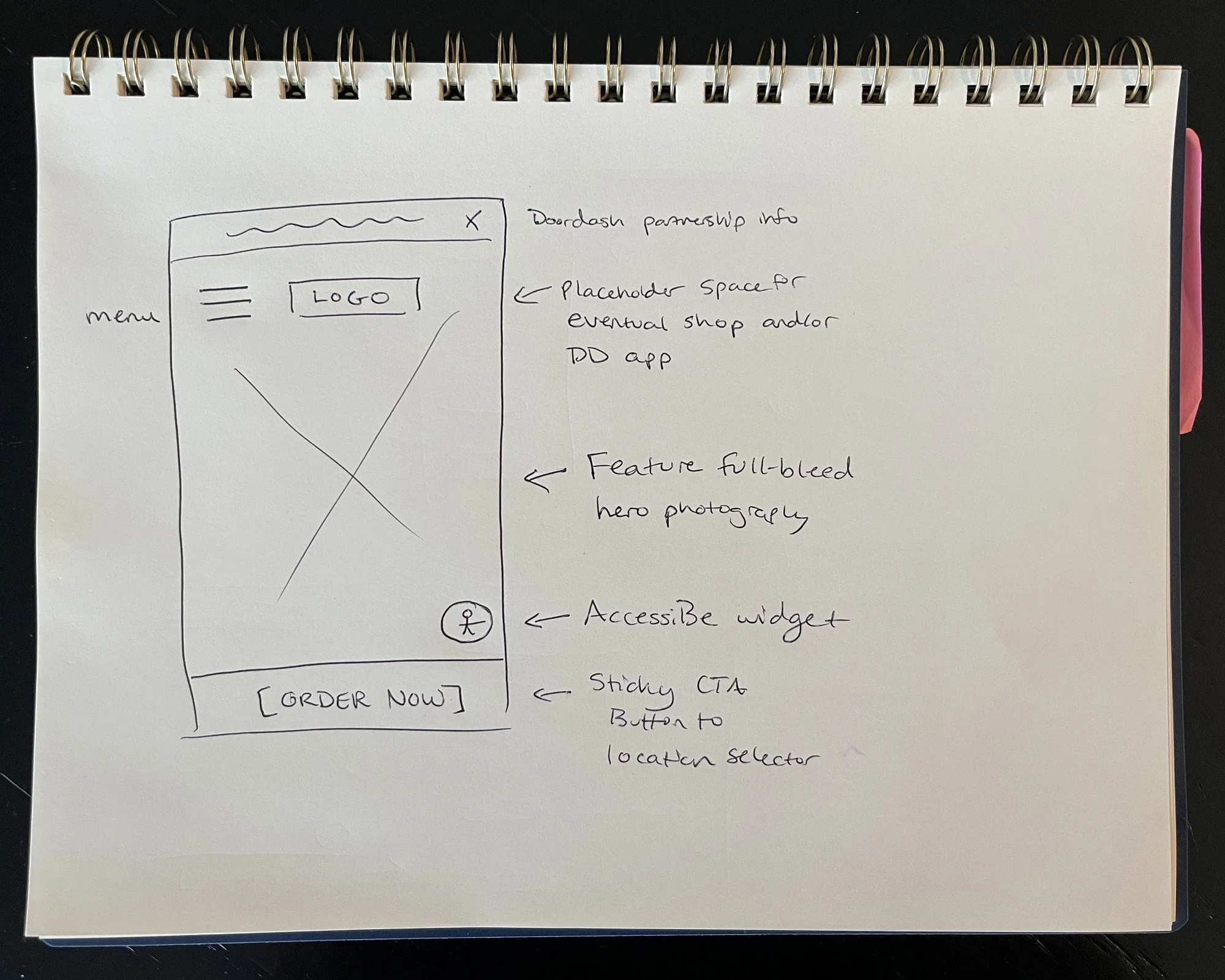
![Hand-drawn wireframe sketch of the Hi.Dozo mobile homepage, annotated with notes on full-bleed hero photography, the AccessiBe widget, and the sticky "Order Now" CTA]()
Decision 01 — CTA Strategy
A persistent "Order Now" option in the navigation, full width styled “Order Now” buttons throughout the homepage, and a sticky mobile CTA, making the path to order visible at every scroll position. Scoped to mobile after testing surfaced layout conflicts on desktop. -
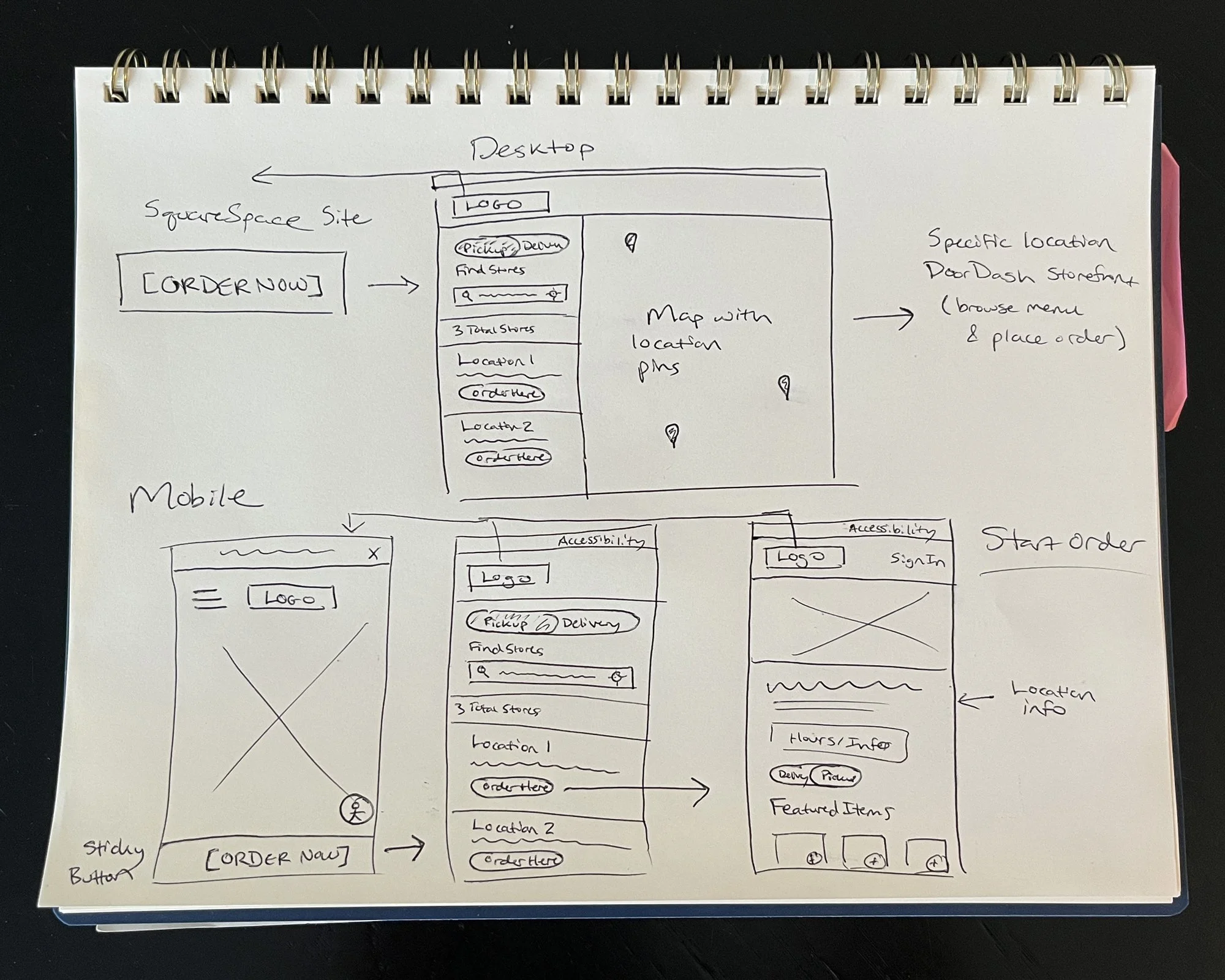
![Hand-drawn wireframe sketches of the DoorDash location selector flow on desktop and mobile, showing the store list, map view, and transition into the branded storefront]()
Decision 02 — Location Selector
A DoorDash Commerce Platform location selector that pre-qualifies users by delivery zone before they ever reach the menu, directly solving the out-of-range frustration identified as a critical edge case in research. -
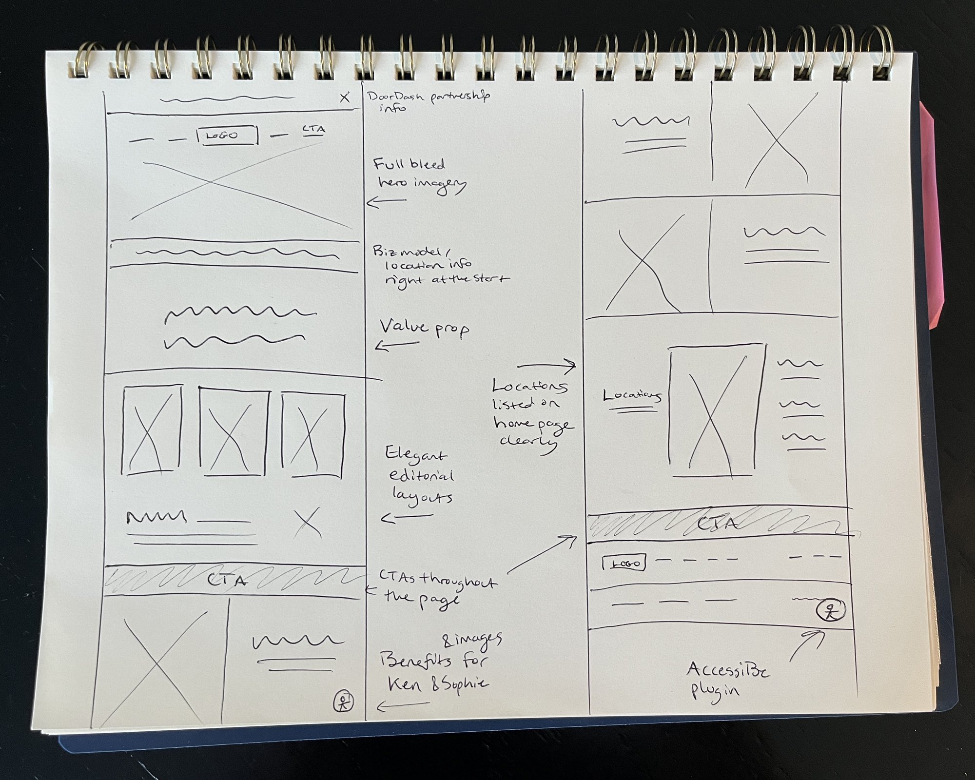
![Hand-drawn wireframe sketch of Hi.Dozo homepage layout direction, annotated with notes on hero imagery, value proposition placement, and editorial-style content blocks]()
Decision 03 — Visual Hierarchy and Brand Elevation
Full-bleed, text-free hero photography and a restrained editorial layout informed by the Louis Vuitton benchmark, ensuring the digital experience reflected the premium standard of the product itself. -
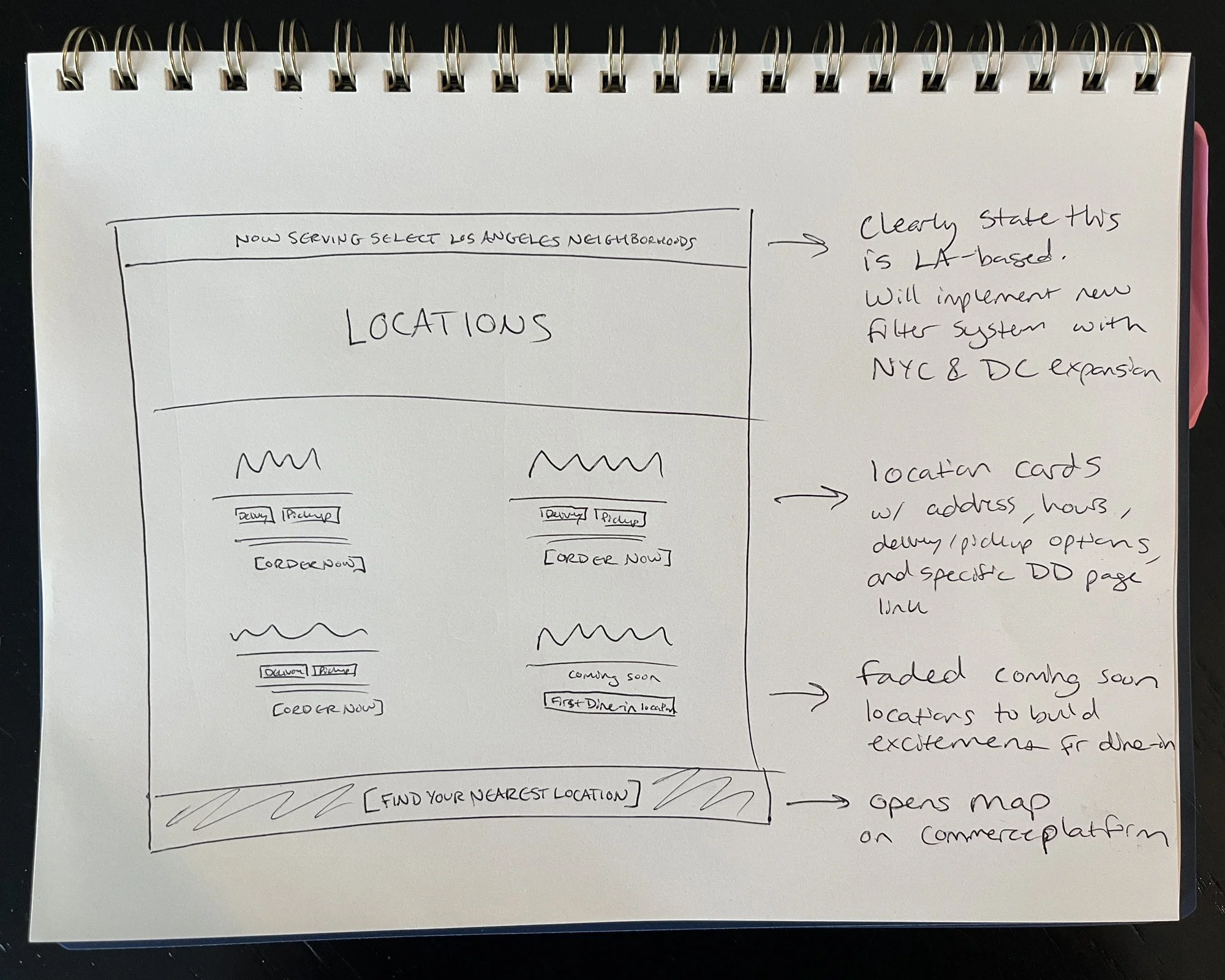
![Hand-drawn wireframe sketch of the Hi.Dozo Locations page, annotated with notes on location cards, delivery and pickup tags, and a "find your nearest location" CTA]()
Decision 04 — Locations Page
A dedicated Locations page modeled on Van Leeuwen's card structure, giving users address, service area, hours, and a direct order link per location before they commit to the ordering flow.
THE SOLUTION
This project called for close cross-functional collaboration across two separate platforms. I owned the full Squarespace design and development independently, but the ordering experience lived on DoorDash's infrastructure, which meant working directly with their Commerce Platform team, Chloe Lloyd, Saman Mahini, and Devin Johnson, throughout the process.
That collaboration started with a series of working sessions to understand the full capabilities and limitations of the Commerce Platform before committing to any design decisions. From there, I developed wireframes specifically for the location selection page and the DoorDash storefront, which I handed off to the DoorDash team to build on their end. Customization options on their platform were limited, so rather than designing in a vacuum, I provided detailed design recommendations and brand guidelines to ensure the transition from the Hi.Dozo website to the DoorDash ordering experience felt as seamless as possible. The goal was for users to feel like they were still within one experience, not redirected to a different product.
Throughout the project, I used Claude as an AI-assisted workflow tool for project organization, research synthesis, and documentation. During the Squarespace build, I also used Claude for code assistance to develop custom features, including the contact window integration and other front-end components that extended Squarespace's native capabilities.
Hi-Fi Wireframes / Prototypes
Project Deliverables
Full Squarespace design and development across the homepage, About, Locations, Menu pages, and secondary legal pages, built on the new brand system and incoming lifestyle photography
A persistent, on-brand "Order" CTA in the navigation and a sticky mobile order button, reducing the number of steps between landing on the site and reaching DoorDash
Site-wide accessibility through an accessiBe integration, on-page SEO, fully responsive layouts, and optimized image assets to support load speed
Direct collaboration with the DoorDash Commerce team to configure and style the branded storefront, including the location selector that allows customers to confirm delivery or pickup availability before reaching the menu
TESTING & ITERATION
Given the project's two-month timeline, I focused testing on functional validation and stakeholder review rather than a formal usability study with outside participants. Testing happened in two stages.
Figma prototype review. Before moving into the Squarespace build, I walked Vito and the Hi.Dozo team through high-fidelity Figma prototypes of the key flows. This gave stakeholders a chance to review and approve the experience before any code was written, and surfaced a handful of adjustments to layout and copy that I incorporated before building.
Build and flow testing. After building the site in Squarespace, I ran cross-device and cross-browser testing across the full ordering flow, from homepage through DoorDash checkout, to validate functionality and responsiveness. This also included:
Hands-on troubleshooting of the sticky mobile order button. Testing surfaced layout conflicts on desktop, so I made the call to limit the sticky CTA to mobile, where the need was greatest and the trade-off was smallest
Verification of the full ordering path across devices, confirming the handoff between the Squarespace site and the DoorDash Commerce Platform storefront was seamless
Storefront Integration and Styling
Connecting the two platforms required me to implement all of the custom code on the Squarespace side, writing and testing the integration between the website and the DoorDash Commerce Platform storefront myself. On the DoorDash side, I shifted into more of a design consultation role, working with Chloe, Saman, and Devin's team on the storefront configuration and pushing for revisions until it met three standards: visual consistency with the broader Hi.Dozo brand, a clear presentation of both delivery and pickup options with a map view, and a seamless flow between the two platforms that felt like one continuous experience rather than a redirect to a different product.
RESULTS
Measuring Success
Success was defined against a single product goal: enable customers to quickly understand the delivery-only omakase experience and seamlessly place an order through DoorDash, reducing friction, increasing clarity, and reinforcing premium brand perception for busy, first-time, and experience-driven customers. Three metrics tracked this directly:
Decreased time-to-order, measured as a faster path from landing on the site to reaching DoorDash
Increased "Order Now" CTA engagement
Higher click-through rate from the website to the DoorDash storefront
25%
Increase in click-throughs to DoorDash
30%
Decrease in time-to-order
20%
Increase in Order CTA engagement
* These numbers are based on preliminary data comparing Squarespace analytics before and after launch. Vito has confirmed meaningful increases in click-throughs since launch, but longer-term tracking through the DoorDash merchant dashboard will confirm the full picture.
REFLECTION
Before & After
The original site lacked consistent branding, presented a hero image weighed down by a heavy text overlay, and routed every customer through an unbranded, 30-second redirect before reaching a menu. None of this reflected a Michelin-level product. The before-and-after comparison is among the clearest evidence of this project's impact.
What I Learned
This project pushed me to build a confident, well-justified design direction without the conditions I'd usually want: no existing customer data, no dedicated research budget, and a two-month timeline. Leaning on secondary research, competitive benchmarking, and close collaboration with Vito taught me that a lean research process can still produce strong outcomes, as long as every decision stays traceable back to evidence.
I'm also genuinely proud of solving a problem that went beyond the original brief. Moving Hi.Dozo onto the Commerce Platform meant the business could finally start to understand its own customers, something it had never had before this project. That's the kind of outcome that keeps paying off long after the redesign wraps.
This was also my first project requiring this level of sustained collaboration with an external platform's implementation team. It taught me how to advocate for design and brand consistency inside a system I didn't fully control, how to escalate clearly when communication broke down, and how to tell the difference between a moment worth pushing on and a moment to adapt to platform constraints instead.
What I'd Do Differently
A few things I'd approach differently with more time or scope:
Build in research budget upfront. The biggest constraint on this project was the absence of real customer data. Going forward, I'd advocate earlier in the scoping conversation for dedicated user research time and budget, even a small round of 5 interviews would have strengthened every design decision downstream.
Set up analytics from day one. I hadn't established a clean baseline before the new site launched, so proving impact meant digging back through historical Squarespace data after the fact rather than comparing against numbers I'd already isolated. Setting up Squarespace analytics and DoorDash Commerce reporting from the start of the build phase is now a standard step in my process.
Ask DoorDash earlier about available data. Even under the Marketplace plan, there may have been aggregate or anonymized order data DoorDash was willing to share. I'd push for that conversation sooner rather than assuming it wasn't available.
Run a structured usability test before the Squarespace build. Stakeholder walkthroughs were valuable, but outside participants would have caught things that felt obvious internally. Five participants in a structured session before committing to the build would have been worth the time.
What's Next
With the website and Commerce Platform integration live, I'm now working with Hi.Dozo to scope a dedicated ordering app on the DoorDash Commerce Platform, extending the location selector work into a faster return path for repeat customers.

Want to learn more about working together?
Tell me a bit about your project and we can schedule your free 30 minute consultation!