
Qwerry
Qwerry is a full-service, research-first brand consultancy that helps organizations make confident business decisions based on data. Their team specializes in building strategies grounded in an outside-in view, helping clients ask and answer the right questions to defend and improve their brands’ performance.
When Qwerry approached me, they were in the process of evolving from a traditional research firm into a brand consultancy known for clarity, insight, and strategic impact. They needed a full rebrand — from name and identity to web presence — that reflected their forward-thinking approach and made data approachable, actionable, and shareable.
Deliverables
Brand Rename & Strategy
Creative Direction & Mood Board
Custom Logo System + Variations
Color Palette Development
Typography Pairings
Brand Patterns, Icon Design, & Visual System
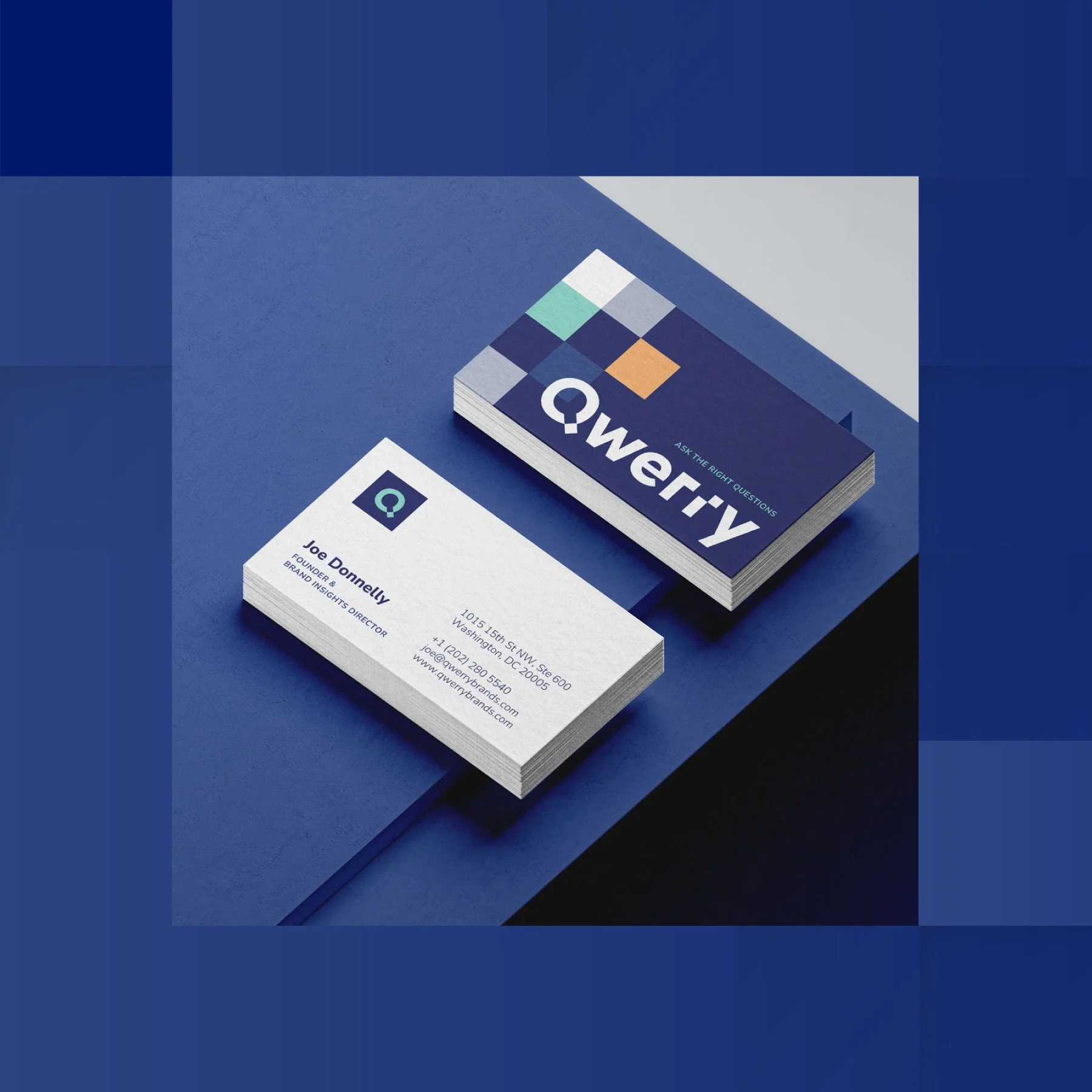
Letterhead & Business Cards
Presentation Deck
Stock Photo Curation
Brand Style Guide
Content Audit & Competitor Analysis
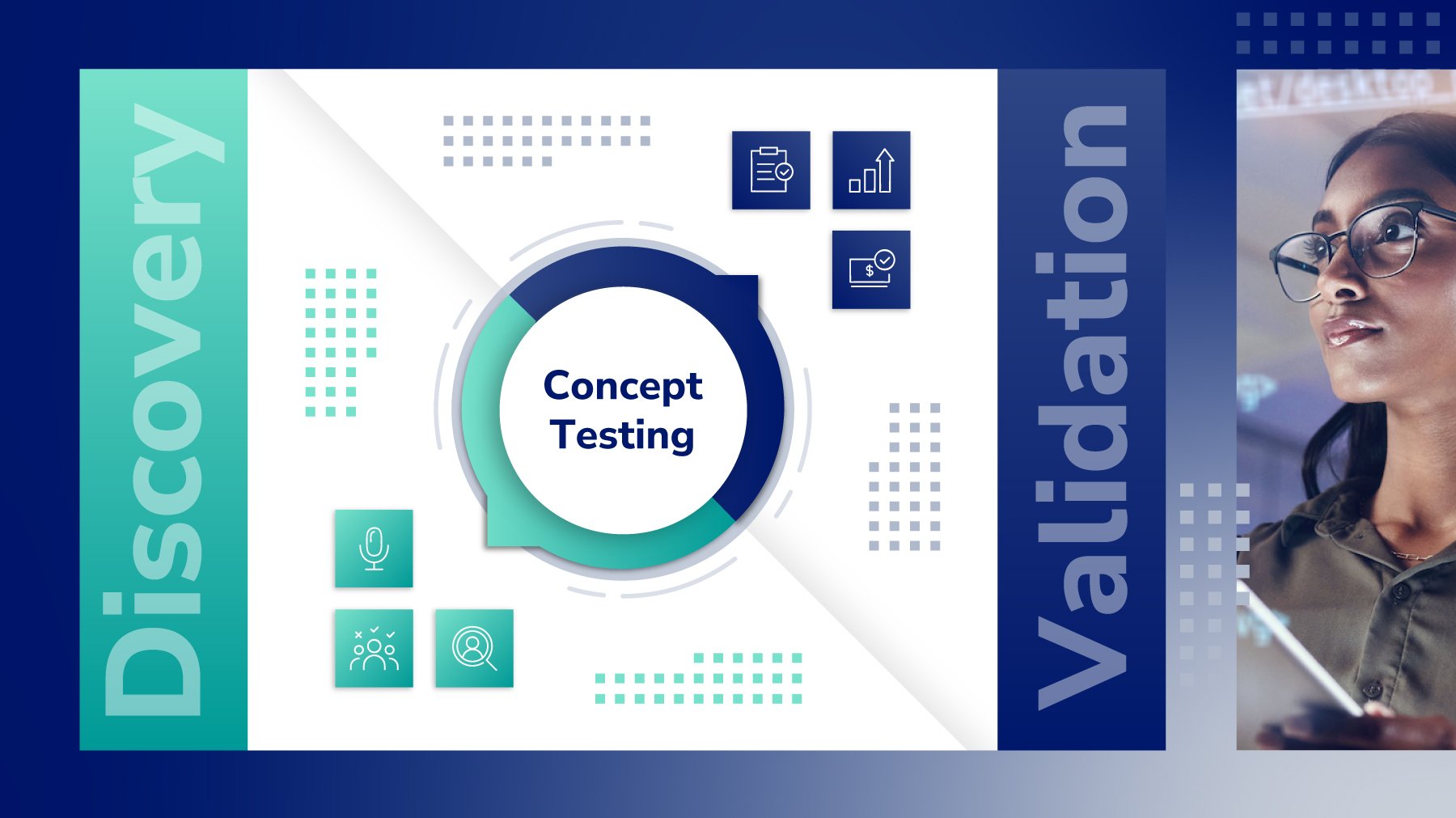
Custom Website Graphics, Infographics, & Assets
Responsive Website Design & Development (Squarespace)
Challenge
The existing brand and name (Hot Iron Brands) didn’t capture the consultancy’s evolving mission or the sophistication of their analytical process. They needed a distinctive, modern identity that could bridge the analytical and creative sides of brand strategy — something intelligent yet approachable, professional yet human.
Additionally, their website needed to communicate complex research services in a way that felt clear, visual, and engaging — while providing a seamless UX for diverse audiences ranging from corporate executives to startup founders.

Audience & User Insights
Qwerry exists for two primary audiences: TEAMERS and DREAMERS.
TEAMERS are collaborative, energetic, and want to share insights across their organization. They need clear, visual tools to facilitate consensus and drive change.
DREAMERS are contextual, reflective, and thrive on data. They enjoy exploring insights through interactive dashboards, infographics, and resources that allow them to dig deeper.
Understanding these audiences guided my design decisions throughout the project. I structured the site and resource library to support different modes of exploration, paired icons with text for faster comprehension, and designed layouts that balance data, visuals, and open space — ensuring the platform serves both audiences effectively.

Solution
Through a research-driven discovery phase, I conducted a content audit, competitor analysis, and market positioning review to understand how Qwerry could stand apart. This strategy informed a full rebrand and website experience designed around clarity, curiosity, and trust.
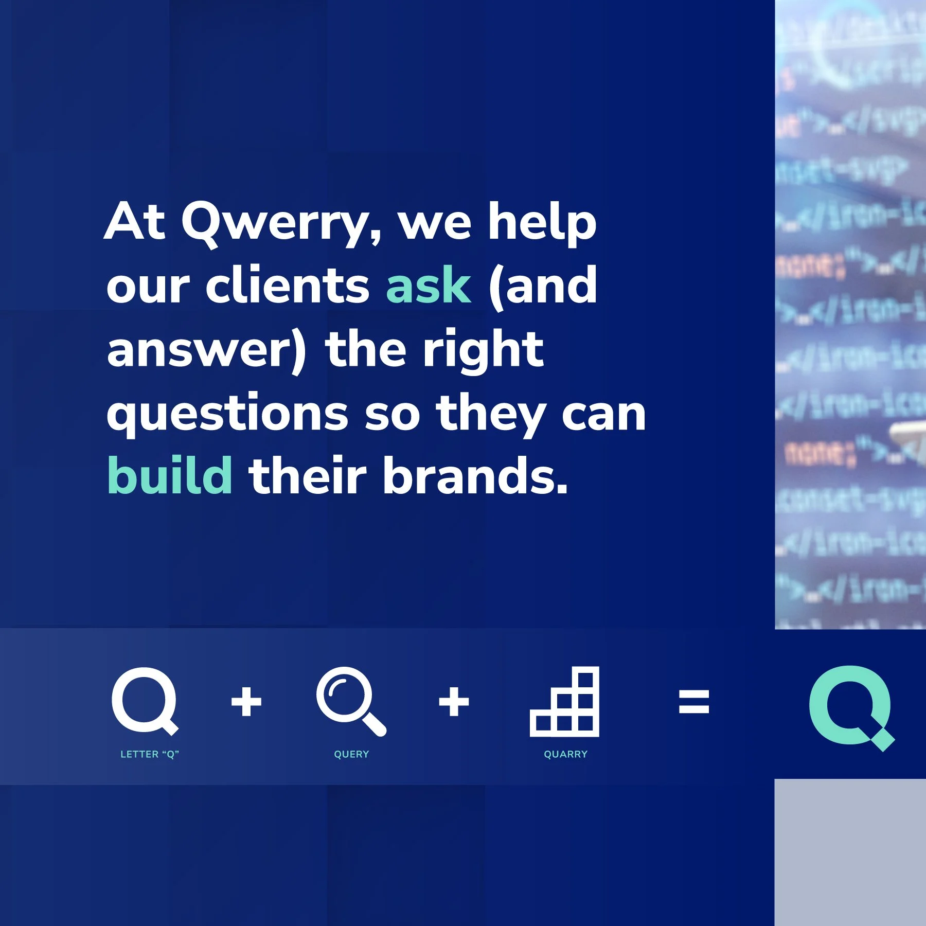
The new name, Qwerry, draws from the words query and quarry — a nod to both questioning and craftsmanship.
Years ago, stones used to make inspiring structures were marked with their quarry source – one of many early signs of branding as we know it. To query is to ask questions to check validity or accuracy.
At Qwerry, we help our clients ask (and answer) the right questions so they can build their brands.
The identity system reflects this curiosity through minimalist geometric forms, bold contrast, and subtle motion cues that evoke exploration and discovery.

Brand Identity
Rooted in the Sage archetype, Qwerry’s brand identity expresses curiosity, logic, and insight — the hallmarks of a trusted research partner. The entire system was built around two core ideas: Discovery and Alignment.
Visual Metaphor:
Discovery: Represents Qwerry’s investigative nature. Expressed through dynamic gradients, displaced geometric elements, and vibrant accent colors like mint and light orange.
Alignment: Reflects structure and clarity — grid layouts, balanced white space, and square motifs inspired by building blocks and the origins of branding (quarry).
Logo:
A bold, minimal typographic mark featuring an offset square that nods to both the query and quarry origins. It captures Qwerry’s dual personality: curious and logical.


Color Palette:
Logical: Royal blue, sapphire, ice blue, white — clean, trustworthy, analytical
Curious: Mint, teal — fresh, innovative, modern
Insightful: Light orange — warm, energetic, human
Typography:
Primary: Nunito Sans — approachable and professional
Secondary (Microsoft safe): Neue Haas Grotesk Text Pro — ensures visual consistency across presentations and SharePoint

Icon System:
Primary icons: Foundational geometric shapes, used as breadcrumb indicators across site and presentations
Secondary icons: Simple line art visuals to explain key services and ideas more literally
Supporting Elements:
Modular square patterns, grid-based layouts, dynamic gradients, and layered background textures for depth
Photography featuring real people interacting with data — friendly, dynamic, and intelligent
Together, these elements create a brand identity that feels modern, confident, and wise, seamlessly bridging the gap between data and discovery.

Website & UX Design
The Qwerry website translates a data-driven consulting brand into a digital experience that’s insightful, intuitive, and human.

Strategy & Structure
Built a user-centered IA
Simplified navigation with breadcrumb icons to orient users
Created a responsive design emphasizing hierarchy, whitespace, and flow
Accessibility & Clarity
Implemented alt text, contrast ratios, and structured headings for full accessibility
Optimized all pages for SEO and readability
Paired icons with text for easier comprehension
Added distinct calls-to-action for lead generation and engagement
Dynamic Content
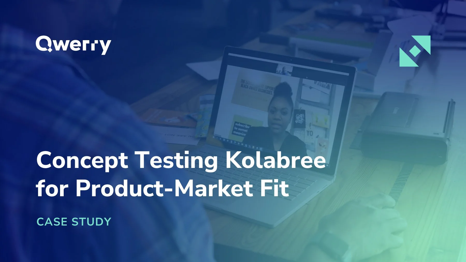
Each service has its own dedicated page, while the Insights Blog and Resource Library serve as living hubs for Qwerry’s thought leadership. I designed:
Custom blog covers
Infographics and visual data summaries
Downloadable worksheets and guides

Design System
The website adapts across light and dark themes, maintaining brand consistency and visual balance between curiosity and logic.

Ongoing Partnership
This site isn’t static — it’s a living, evolving platform. I continue to collaborate with Qwerry founder Joe Donnelly to:
Design new content for the website and resource pages
Enhance the user experience based on audience needs
Support upcoming service offerings and UX initiatives
Most recently, I helped develop a new product line called the Qwerry Brand Framework. We’re still in the process of building this out, but so far, I built a visual model using geometric squares to represent the four tiers of service, along with:
Client-facing presentations
Mockups and custom icons
A dedicated landing page that clearly visualizes the Essentials service offering process


Conclusion
Through this ongoing collaboration, I help Qwerry continue to translate their strategic, research-first approach into clear, actionable, and visually engaging experiences. It’s been such a joy collaborating with Joe and supporting Qwerry’s mission to make research more accessible and actionable. Our partnership has been grounded in trust, creativity, and shared purpose; and I’m genuinely excited for all the projects we’ll bring to life next.


“Nicole thinks big, bringing research-based rationale and a clear process that helps me elevate my own work. She thinks about the brand in context and brings multiple perspectives to the table — from visual design and UX to audience psychology. She’s a true creative partner who helps translate complex ideas into meaningful, human-centered design.”
— Joe Donnelly, Qwerry
Want to learn more about working together?
Tell me a bit about your project and we can schedule your free 30 minute consultation!