
Simplovefy
Simplovefy offers bespoke wedding planning and coordination with a fresh, inclusive approach. Their mission is to remove the stigma that wedding planning must be stressful, instead making it a calm, curated, and joyful experience for anyone in love, regardless of identity or orientation. Simplovefy positions itself as a teammate: reliable, understanding, light-hearted, and focused on keeping the couple’s love at the center of planning.
Deliverables
Creative Direction & Mood Board
Custom Logo System + Variations
Color Palette Development
Typography Pairings
Brand Patterns & Visual System
Stationery
Homepage Wireframe / Front-End Design
(website starter kit)Stock Photo Curation
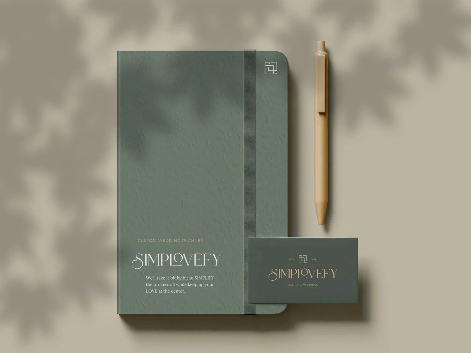
Journal Cover (custom planning journal mockup)
Brand Style Guide
Challenge
Jessie came to me ready to launch an inclusive, high-touch wedding planning service but didn’t yet have the brand foundation to attract clients. The challenge was to craft a visual identity that felt modern, elegant, and approachable, without leaning into traditional, bride-centric wedding clichés. The brand needed to communicate accessible luxury and a calming presence while remaining gender-neutral and welcoming to all couples.

Audience
Jessie’s ideal clients are people who want a streamlined, high-quality planning experience — couples aiming for destination or luxury celebrations who value thoughtful curation, clarity, and trustworthy vendor relationships. They want reassurance that planning will be organized, enjoyable, and centered on their partnership rather than industry jargon or outdated expectations. These insights guided tone, language, and visual decisions across the brand system.
What We Did
Creative Direction & Visual Strategy
I started with a mood board and creative direction that blended modern elegance with grounded, approachable elements. The visual story needed to signal both luxury and comfort — colors and forms that feel premium without being fussy.
Logo & Mark System
I designed a multi-part identity system:
Primary logo: a balanced mark combining a modern serif wordmark with a square emblem to convey trust and structure.
Alternate logo: a clean typographic logo with dramatic ligatures for editorial moments.
Submark: a rounded rectangle submark that integrates Montserrat and the square motif for flexible use across stationery and social.


Icon Symbolism
The square icon is composed of four symbols woven together: a stylized S, two overlapping rings, a Venn diagram (for union/relationship), and the square form itself. Together they demonstrate how a clear, client-centered process that keeps the couple at the center makes planning organized, calm, and fun. This icon aligns with the overall brand promise:
We’ll take it bit by bit to SIMPLIFY the process all while keeping your LOVE at the center, thus, Simp-love-fy.

Color Palette
I developed a color palette that feels modern and down-to-earth while still luxurious:
Primaries: forest green, sage green
Accent: gold
Neutrals: linen, beige, sienna

Typography
Typography was chosen to balance elegance and legibility:
Custom modern serif (logo & display ligatures)
Lora for headers (refined, readable serif)
Montserrat for body copy (wide, legible sans-serif)
Supporting System & Collateral
I created organic brand patterns, stationery options, and curated a brand photography direction that avoids stereotypical pink and “fluffy” wedding tropes. Photography focuses on authentic moments and editorial compositions that feel timeless and inclusive.
Journal & Marketing Assets
I designed a journal cover for Simplovefy’s custom planning journal, plus a marketing flyer/card to demonstrate the brand in print and show the hierarchy of type and color in real applications.


Homepage Wireframe & Front-End Design
I built a homepage wireframe and front-end visual concept to show how the brand translates to a website — typographic hierarchy, color usage, and content blocks that highlight process, services, and the recommended vendor list. Jessie decided to build the site herself for budget reasons, so I delivered a thorough starter kit she can implement confidently.


Conclusion
Simplovefy’s identity balances accessible luxury with warmth and reliability. The system I delivered gives Jessie a professional, inclusive foundation to attract the clients she wants — from intimate local weddings to future luxury destination bookings. Even though Jessie opted to build her website independently, she now has a complete visual and UX starter kit (logo system, color and type hierarchy, wireframe, marketing assets, and a brand guide) that positions Simplovefy to grow with confidence.
Want to learn more about working together?
Tell me a bit about your project and we can schedule your free 30 minute consultation!