

Your Space Your Stories
Brand Identity, Website Design & Platform Strategy for a Youth Mental Health Podcast
Your Space Your Stories (YSYS) is a 501(c)(3) nonprofit podcast created by Jodi Byrge and Dr. Christina Sally. Each episode brings together teens and young adults (ages 13-24) to talk openly about topics they might be facing, like anxiety, academic pressure, bullying, body image, trauma, and the courage it takes to ask for help. The mission is simple, and it runs through everything we built together:
Through your stories, we collectively build a stronger, more compassionate community where everyone belongs.
Deliverables
Brand Strategy, Mission & Values Definition
Custom Logo System (Primary, Horizontal, Submark & Icon)
Color Palette & Typography Pairings
Brand Pattern & Visual System
Brand Style Guide
Design System (Figma)
Marketing Collateral (Podcast Cover Art, Apparel, Stickers)
Multi-Audience Messaging & Copywriting
Information Architecture & Wireframing
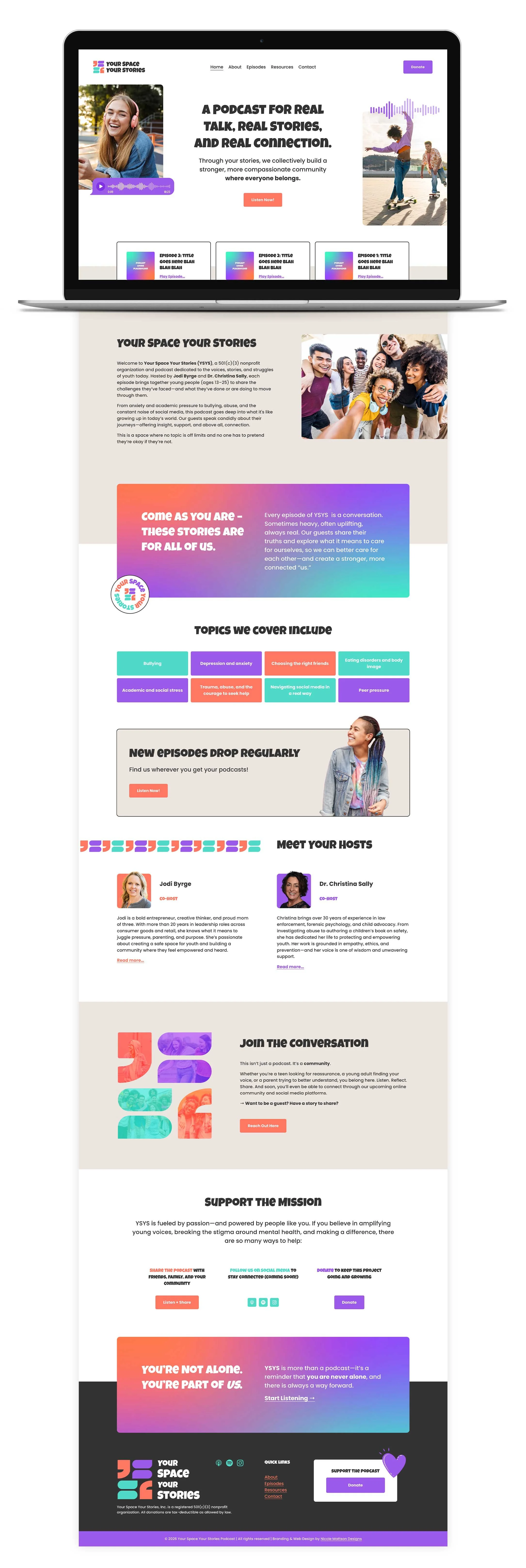
Custom Squarespace Website Design & Development
SEO, Accessibility & Responsiveness Testing
Platform Strategy & Evaluation
The Challenge
Jodi and Christina came to me with a concept, a mission statement, and a lot of heart, but they needed a full brand identity and a website that could carry that mission into the world. As a young nonprofit still fundraising and recording their first episodes, they wanted the foundation fully built and ready to go the moment they were ready to launch.
YSYS isn't just a podcast, it's a nonprofit trying to build trust with several different audiences at once, on a foundation that didn't exist yet. There was no established brand, no existing website, and no library of past episodes to point to. Everything had to be built from the ground up: a visual identity that felt warm and credible rather than clinical, a website that could speak to teens and parents and donors without losing any of them, and a content structure flexible enough to grow alongside a nonprofit that was still finding its shape.
The organization was also working within real constraints. Funding was still coming together, episodes were still being recorded, and decisions like which donation platform to use were on hold pending a legal consultation. I was designing for a version of YSYS that didn't fully exist yet, built to be ready the moment it did.
Who We Were Designing For
Early on, I spent time identifying YSYS's core audiences, since each one needed something different from the brand and the site.
Teens & young adults (13-24) are the heart of the podcast. They're most likely to discover an episode through Instagram or TikTok before ever landing on the website, so the experience needed to feel relatable, visually cohesive, and mobile-first above anything else.
Parents show up with a different job to do: evaluating whether this is a legitimate, trustworthy space for their kid. For them, clear information, a professional design, and visible credibility signals mattered more than anything flashy.
Donors & supporters needed simplicity and trust. Most would be giving from their phone in a moment of feeling moved by the mission, so the messaging leading up to any donation had to build confidence quickly and clearly.
Designing for all three meant the brand voice had to flex without fracturing. That shaped nearly every decision from here forward.
What We Did
Brand Identity & Visual System
I started with YSYS's mission and values (inclusive, compassionate, inspiring, energetic, modern, educational) and built a visual identity to match. The core brand icon is made up of four building blocks: a quotation mark / abstract face and paired speech bubbles that double as the letters Y and S. Individually, each element represents a piece of someone's story. Together, they fit like building blocks into something stronger and more resilient, which is exactly the metaphor behind the mission itself.
From there, I built out the full system: a coral, purple, and turquoise palette energetic enough to feel youthful without losing warmth, a playful primary typeface paired with a clean, legible body font, a repeating brand pattern built from the icon's four shapes, and a full suite of marketing materials, including podcast cover art, apparel, and stickers, so the brand could travel beyond the website.
Content, Information Architecture & Copywriting
Writing for YSYS meant developing three distinct but related tones: one for teens looking for relatability, one for parents looking for reassurance, and one for donors looking for trust. I mapped out the site's information architecture, built high-fidelity wireframes for the key pages in Figma, and wrote all of the copy myself, including the mission statement, host bios, episode structure, and resource pages.
Because YSYS deals directly with sensitive topics like abuse, eating disorders, and mental health crises, I also built a dedicated resources page connecting visitors to trusted crisis and support organizations. That felt non-negotiable for a brand built around this audience.
Website Design & Development
After the wireframes had been approved, we were ready to move into the build. I chose Squarespace deliberately, not just because it's the platform I know best, but because it supported two things that mattered to Jodi and Christina beyond the launch itself. First, they eventually hoped to offer a hands-on internship or work opportunity to a teen or young adult interested in web design, someone who could learn to update the site themselves each time a new episode dropped. Squarespace's editor is approachable enough to make that kind of on-the-job training realistic, which felt like a meaningful way to extend YSYS's mission into how the organization actually operated day to day. Second, it gave the nonprofit real room to grow: the ability to add an events calendar, a blog, or even a storefront down the line, without rebuilding the foundation from scratch.
I designed and built the full site in Squarespace, including home, about, episodes, resources, donate, and contact pages, with SEO, accessibility, and responsiveness tested across every page. The donation flow was intentionally left flexible while Jodi and Christina worked through a legal consultation on which donation platform to use, so the structure was ready to plug in a solution as soon as that decision landed.
An Unexpected Pivot
Once the site was built, there was a natural pause while Jodi and Christina focused on recording their first episodes and securing funding. During that time, a new advisor joined their board to help them think through podcast production and workflow. He recommended Podpage, a podcast hosting platform built around AI-driven automation, including auto-generated social content and automatic episode publishing.
That recommendation turned into a genuine product question, not just a technical one. Was automation solving a real workload problem for Jodi and Christina, or was it a nice-to-have that would trade away flexibility they'd eventually need for donations, events, or a future storefront? I put together a full platform evaluation comparing three directions: staying fully on the Squarespace site we'd built, a hybrid model that kept Squarespace as the nonprofit hub while Podpage handled episode automation, or a full transition to Podpage as the primary platform. I evaluated each option against how it would actually affect the teens, parents, and donors we'd designed for, not just how much time it would save internally.
Based on that research, I recommended the hybrid model. It offered real automation benefits while preserving the storytelling flexibility and growth runway we'd built the Squarespace site around, with less risk than a full rebuild. But Jodi, Christina, and their advisor felt a full transition better matched where they wanted to take the organization next, and that was their call to make. They moved forward with a complete transition to Podpage, and they're now working directly with Podpage's development team to rebuild the site, using the sitemap, wireframes, design system, and copy I'd already built as the foundation.
What I Learned
This project taught me a lot about what it really means to design for both users and the business at the same time, especially when the business itself is still figuring out what it needs.
YSYS's first priority was a narrative-driven nonprofit hub: a place where a parent or donor could sit with Jodi and Christina's story, feel the depth of the mission, and be moved to give. Around that story, we built room to grow with available features like an events calendar, a blog, a future storefront, and a real opportunity for a teen to learn web design by managing the site. By the time the new advisor joined, the priority had shifted toward producing episodes faster, since more content meant more reach and, eventually, more donations too, just through volume instead of depth. Neither approach was wrong. They were two different theories for growing support behind the same mission, and the job was designing for whichever one was true at the time. Both are still just hypotheses, though, and the real key will be testing to see which approach actually earns more trust and support once YSYS is live.
So the key lesson from this that I'll be taking with me moving forward is that business needs need to be considered alongside user needs on the same level, especially when they shift mid-project. I also wish automation had been part of the conversation from day one instead of something we adapted to later. Going forward, I want to ask upfront where new tools, especially AI tools, might change a platform decision and better meet a business objective, rather than treating that conversation as an afterthought.
None of this was fully in our control. Funding, recording, and board priorities all shift on their own timeline, and that's simply what building something real looks like. What carries forward regardless is the branding, structure, copy, and research behind YSYS, including the Figma design system already guiding the team building out the new Podpage site. I'm proud of that foundation, and I can't wait to see Your Space Your Stories live and finally reaching the young people it was made for! I'm grateful to still be in Jodi and Christina's corner as their ongoing brand consultant, and I'll be cheering this team on every step of the way.
Want to learn more about working together?
Tell me a bit about your project and we can schedule your free 30 minute consultation!